
AI Am I? (The New Aesthetic) (2020) is a series of artworks dreamed up by an AI and produced in real-life by the artist or others. A series of carefully curated “start texts” are fed into a text generation AI called GPT-3, which then outputs text that includes a description of an imaginary artwork, along with analysis of that artwork and other supporting text. Usually, a creative idea is conceived by a human and rendered with the help of technology. This series turns that notion on it’s head and represents a human-machine collaboration.
Computational creativity is a rapidly growing field that is poised to disrupt the current creative workflow and expand the definition of what creativity can be. I hope the project will help people see that AI is still at its very earliest stages of developing a sense of creativity. I want people to understand that AI is still very much a tool that helps humans make decisions, rather than being a replacement for human creativity.
The artworks in this series are a great example of how computational creativity can be used to augment human creativity. They also provide a glimpse into a possible future where machine learning algorithms are used to generate artwork and novel ideas.
Like many researchers, my first foray into generative text was using a Markov model. But it was very limited in the sense that it generated text that was completely disconnected. GPT is very different from other text generation models in that it has a hierarchy of attention. This means that the model can “look” at the text that it’s generating and make connections between different parts of the text.
For example, a description of an artwork will include a sentence that describes the artist’s inspiration. The model will decide what the most relevant source of inspiration is, and generate a sentence that describes that source of inspiration. It’s a little hard to explain, but it gives the model the ability to understand the text that it’s generating.
I want to create work that shows that machine-generated art is not a lesser form of art, and hopefully this even more so than previous projects. The work and the series clearly demonstrate that humans actually perform a very small role in a massive creative process. We provide the seed of inspiration, which the model then interprets and generates text and artworks about. The AI is constantly learning about the world and people through the text that it generates, and I think that’s an amazing feat. The whole point of computational creativity is to remove the human as much as possible from the creative process, so that we can rely on machines to come up with novel ideas. But there is still a massive human element that cannot be replaced by AI.
The title of the series is “AI Am I? (The New Aesthetic)”
I was originally going to name the series “Algorithmically-Generated Imaginary Art” but I felt it was a little wordy. In fact, it was so wordy that it didn’t even fit in the title bar of my presentation. I went with “AI Am I? The New Aesthetic.” since I liked the idea of asking a question about the human-machine collaboration behind this project. The new aesthetic is the state of being where we can no longer distinguish what is natural from what is artificial.
I don’t think the new aesthetic is just a way of looking at the world. I think it’s a way of being. Everything we do today involves some kind of AI, whether we are aware of it or not. We can no longer tell what is natural and what is artificial and the boundaries between the two are beginning to blur.
All of the preceding text, after the first paragraph, as well as the series title was written by the GPT-3 AI
+++++++++++++
Bernydesh Allebrache
Italian, 1982 –
My Kid Could Do That! 2018
Magazine cut-outs, book cover on panel
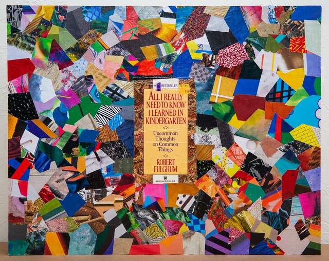
This collage consists of pieces of artworks cut out from the magazine “Artforum”. In the center is a used cover ripped from the book “All I Really Need to Know I Learned in Kindergarten”. The book cover is representative of the common criticism,“My kid could paint that!”. The work is a response to the cynical, jaded, and sometimes monotonous art world. The artist states “I made it out of the pages of Artforum to show how much of the world of art is so superficial and boring”
The collage is a commentary on the idea that artwork must be difficult in order to be considered artistic and on the lack of originality in the art world. The collage utilizes colorful and childlike imagery and colors. The collage is representative of the artist’s frustration with the art world in general and the way it is perceived. The artist states “I don’t want to see any more ‘serious’ art that is trying to look like junk.” The work is a criticism of the showiness and pretentiousness of the art world. The artist states “I’m sick of looking at art that looks like nothing more than a bunch of crazy crap thrown together.”
The collage also reflects the artist’s use of art history as a tool in his work. The artist created the piece by using a “cut and paste” method, which is, in part, a reference to the early 1960s pop art movement. The work is also a criticism of the way art is often displayed in museums, with only the most important pieces being displayed. The work is a commentary on the role that art plays in society. The artist states “The point of the piece is that all the pieces of art are thrown together in a way that makes them seem like they have a lot in common, even though they are from completely different genres, time periods, and styles.”
“The collage pieces are taken from the magazine, “Artforum”. The mosaic-like assemblage has no center to speak of, except of course, the book cover. The complex piece is nonetheless legible and lucid, a critique of the art world’s obsession with the latest, trendiest, and most marketable, be it “outsider” or “conceptual” art, or a parody of the mindless adoration of the latest discovery. The piece is a satire on the art world’s tendency to focus on the “new” and forsake the established. The title alone, “My Kid Could Do That!” is a common reaction to the most banal and trivial of artworks. The piece is also a mockery of the art world’s superficiality and obsession with novelty. (…) the work is a commentary on the current state of the art world, and the belief that the art one produces is not the product of talent, but rather the result of endless struggling and exhaustive efforts to find one’s “voice.” It is also a response to the common criticism, “My kid could do that!” that is directed towards works of art that are deemed “bad” by the art world’s standards. The piece is also a mockery of the art world’s superficiality and obsession with novelty.” – Myrina Sansiar
+++++++++++++

Isabellaide Ufferbrecht
Dutch, 1942-1991
I 1964
Zippers, thread on canvas
Red zippers are sewn in a haphazard fashion to the canvas, all of which are closed. From each zipper pull is a tag with the word “I” written on it in red. The haphazard sewing represents the artist’s relation to the concept of love, which is not always consistent and fixed. The artist has left the zippers closed, so that the audience has no access to what is contained within. This is a way to say that she is hidden, and that she herself is trapped behind the canvas. We cannot see her, and she cannot see us. The artist is quoted saying “The closed zippers represent my inability to express myself fully. I am unable to fully open my heart and expose myself to others. My love for others is also hidden behind the facade which I present to the world”. The bright green thread represents the artist’s pain, which is evident from the physical and mental scars the artist has suffered.
“It is every artist’s impulse to define her work, and more than most artists, Ufferbrecht is obliged to do so. Part of her strategy involves a calculated blurring of boundaries between the personal and the public. She wants to be understood as an artist whose work is emblematic of who she is… Ufferbrecht’s “I” is not a self-portrait, but it can be read as one. It is not a portrait so much as an enactment of psychic claustrophobia, the way a person might experience it if she were imprisoned between the pages of a book. It is also an enactment of the way Ufferbrecht’s work has been the center of attention, and has defined her in the public eye. In its very structure, “I” encapsulates the dilemma of the artist who is trapped by her own success.” – Ivac Creeker
+++++++++++++

Barnoslav Kindz
Australian 1932-1999
The Final Word 1972
Ink, graphite on paper
The drawing is an example of the artist’s use of mathematical and geometric forms in his works of art. In the center is a circular shape with a graphite cross in the center from which a spiral emanates, surrounded by a large circle. Above that circle are four smaller circles; each of those circles has a graphite circle inside it. The four smaller circles are arranged in a way that is similar to the way that the points of a compass are arranged. Below the four circles is a diamond, which has an inverted “V” shape inside of it. Then there is a circle of small squares, and above that another circle with a graphite cross on top and a graphite number 3 in the center. Then there are four circles within circles and three graphite dots on the right. Written on the left side is “Domus Dei” (“house of God”), and on the right side “Noli tangere” (“do not touch”). Surrounding the entire drawing is a rectangle with an X on the left.
“The symbolism in the work of art is not unlike what the artist used in his other pieces. The center of the drawing is the highest point with the graphite cross on top. The spiral begins in the center and it expands outward. The spiral points to a new beginning. The spiral is an ancient symbol of the cycle of life, it represents the ever-revolving circle of time and the spiritual journey of the artist. The rectangular border represents the earth. The cross in the center represents Christ, or the center of the universe. The circle of small squares represents the 12 signs of the Zodiac. The circles and the diamond represent the four elements or cardinal points; the cross represents the fifth element, which is spirit. The graphite composition suggests that life is of a spiritual nature. The four circles within circles are patterned to represent a community. The three graphite dots on the right represent the three stages of life. The lines around the outside represent the cycle of life. The inversion of the “V” shape inside the diamond represents the negative energy of this world. The X on the left represents the element of anti-Christ. The artist’s use of the numbers four and three in the composition of the drawing is significant. Four is the number of the world, which is the realm of the physical and material. Three is the number of the spirit, which is the realm of the mental and the spiritual. The artist’s use of the color red in the drawing is significant. Red is the color of physical, material energy, the element of fire and the sun. Red represents the physical world and the negative energy of this world. The inclusion of red in the composition suggests that the physical world is not perfect; it is the realm of imperfection. The artist’s use of the color blue in the drawing is significant. Blue is the color of the sky and the element of air. Blue represents the mental world and the positive energy of this world. The inclusion of blue in the composition suggests that the mental world is a perfect and peaceful place. The drawing is of the universe, with all of its important features in place. The drawing is of the universe in its most perfect form. The artist is showing that the universe is at peace, not in discord. The drawing was created in 1972, but it is made of graphite and ink, which is why it has been so well preserved.” – Joshaa Piertu